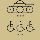
Posters are meant to seize the attention of the viewer and very quickly leave an impression. A poster fails at once if it does not do this. A successful poster is realized when the viewer is pulled in and compelled to take a closer look at the piece, either to gather more specific information or analyze the meaning of the poster. Good posters usually strike a chord emotionally with the viewer and involve a certain level of wit. Great posters move people to action.
Objective
Your task is to create a poster which engages the viewer in a social commentary, involving a subject of your choice. You must use the concept of juxtaposition in your poster to communicate your message. Additionally, make sure you pick a topic that you can back up without resorting to talking points. We are not going to have a debate, but as a creative and citizen, you have a responsibility to understand the messaging you are putting out.
One example of an approach to this would be to lay out a message in type, with the treatment of it and its supporting imagery somehow indicating that you actually are stating the opposite (a sarcastic approach). The point is to change the meaning of content (imagery or text) through its presentation.
Ways of creating juxtaposition include but aren’t limited to:
- Dissonance in image vs text
- Dissonance in image/text vs style
- Clearly disturbing initial impression which invites further investigation
- Contradictory elements creating a whole
Project Specs
- Printed size: 12″ x 18″ CMYK, any paper type (8 x 12 is acceptable for printed submission)
- Physical and Digital Submissions
- At least one original illustration, unless permission is given otherwise
- All artwork must be your own original work. Any exceptions to this must be approved.
Instructions
Step 1
Begin researching the topic of your choice, deciding what you want to say about it and considering how you might approach the project. Discuss with instructor the concept of your poster and the way you would like to approach relaying your message.
Step 2
Begin sketching ideas and creating content for your poster if necessary. You should have at least 5 clear, distinct approaches with sketches (required); all your sketches should be about one topic. It will likely take more than 5 sketches to establish 5 clear directions for where you want to take your poster. Sketches due one class day after assignment.
Step 3
Begin creating your work in Illustrator. You may also use Photoshop to create elements in your work, but your final piece should be in Illustrator. Continue receiving feedback from instructor until the due date. You should be able to show progress each day, and your project should be as close to finished as possible the day before critique, so you can receive feedback on how to finesse your work.
Submission
Compile your working file and a pdf of your poster and place them in a folder labeled [lastname_firstinitial_project4] and place them in the dropbox by the beginning of class. You must also submit a physical copy. This can be printed out at 8×12 to keep the size from going beyond an 11×17 sheet. You do not need to mount this project.


