Visual Hierarchy is the arrangement of elements within a picture plane. In typography, visual hierarchy establishes a predetermined and graduated level of importance and emphasis to the visual elements. Visual hierarchy is used to help the viewer to digest information one step at a time, leading them into the content. As a designer you need to understand this concept so that you can develop a stronger sense of organization.
-
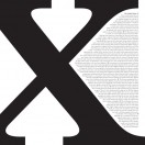
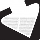
- Character Focus
-
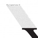
- Headline Focus
-
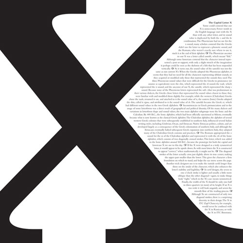
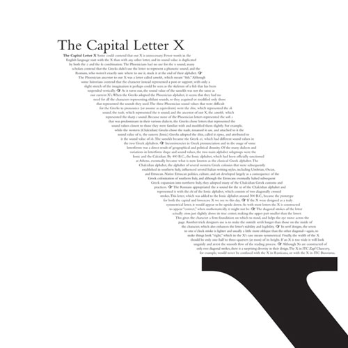
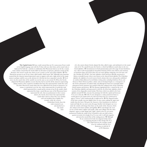
- Body Focus
The focus of each image is achieved using various methods:
Character Focus: The Size of the character is the primary attribute drawing attention. Secondarily, the tension created by the edges of the letter being positioned at the edges of the bounding box draws the eye diagonally across the box, tracing the shape of the X.
Headline Focus: The relative size of headline is again playing a factor in its higher position in the visual hierarchy. Perhaps even more effective is the use of shape: The shape of the character X, which is continued through the body text, draws the eye directly to the all-important headline.
Body Focus: The negative space at the top of the X points directly into the body text. The giant shape of the X which is visible appears to exist only to lovingly encapsulate the body text, which takes center stage here.
Objective
For this project, we will find three ways to arrange typographic elements in a determined space. Your compositions will consist of a letter form, a headline and body copy. You will be taking these three elements and creating three compositions, each time adjusting the visual hierarchy to establish the order of emphasis for each element. See below for project specifications.
Project Specs
- Quantity: 3 pieces
- 8×8″ for each layout
- Color: Black and White only, no grey
3 ORDERS OF EMPHASIS
- (1) letter form | (2) headline | (3) body copy
- (1) headline | (2) body copy | (3) letter form
- (1) body copy | (2) letter form | (3) headline
Requirements
- Single letter form height must be at least 3/4 (three fourths) the height of your layout.
- Headline must not be smaller than body copy in any versions.
- All body copy and headline text must be present and legible. The letter form must be recognizable, even if it is cropped and barely visible.
- You must use either Helvetica or Garamond in your final versions.
- You don’t have to use the same typeface for all your versions, but each version (hierarchy order) must use only one of the above two typefaces.
- The elements of your layout must be only the elements provided: the headline, copy, and letterform. (No arbitrary bars or fields of black.)
- Your character (large) must be legible as the character that it is (3).
Step 1
Gather your content. The content for the body copy, headline and letter form are provided below.
- Body Copy – Download here
- Headline – Lorem Ipsum Dolor Sit Amet Consectetur
- Letterform – 3
Step 2
Begin researching the style and design of your project. Start your sketching process by exploring creative and well developed solutions for your project. Your sketches shouldn’t be smaller than approximately 2×2 inches; any smaller and you can’t get a proper feel for how the elements will work together.
Create 10 sketches for each order of emphasis ( 30 total ), due next class to be reviewed.
Step 3
Once your sketches and concepts are complete and we’ve agreed which are your best versions, begin creating digital versions of the versions we’ve chosen for each emphasis order. using Adobe Illustrator. These versions will be due at the beginning of the next class after you begin in Illustrator ( 1 for each emphasis order, 3 total).
Step 4
After your three parts are complete, show them to me so we can discuss any issues with visual hierarchy and type fundamentals. See Type Handling video at the bottom of the page under Resources.
Submission
You will submit both a digital and a physical submission of the project. Upon completion of all objectives, save all three pieces as a single pdf document called “project-1.pdf”. One method for doing this is as follows: export each version as a pdf (named in a format such as “lhb.pdf” indicating the hierarchy order), and then use Acrobat to combine the files into a single pdf. You may use another method if you know of one, as long as it produces the same result (such as using multiple artboard and exporting a pdf). The order of the pages should be the same order in which they’re listed in the Project Specs: [l-h-b], [h-b-l], [b-l-h] for a total of 3 pages. Place your project pdf and your working file(s) into the same folder labeled with your last name and first name initial (EX. jones_m_project-1). Place your folder into the TYPE2 DROPBOX by the beginning of class on critique day.
Creating your digital submission: View tutorial
Print and mount only the version that you feel is the most successful, using the specs listed above.