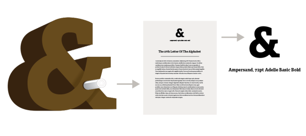
Objective
You are to create a 3-dimensional letterform which can stand up on its own and which is an accurate representation a new typographic character of your own invention. Your 3-dimensional form should also contain a page – either on itself, appended appropriately or built into the structure somehow – with the copy described below along with a printed instance of your character on the medium of your body copy. Your character will be printed on the page as well, as described below. You should pick a font that the character’s DNA is based off. This will be the font name displayed on the page.
Content
The content for your copy should describe what the typographical character is and what it’s to be used for. You should provide historical context (for example, how the character came to be and what social or cultural developments inspired it) and provide guidance as to how to use the character.
You then should provide 1-2 examples of what the character would look like in use.
Also on the page, you should have a printed instance of the character in 72pt (1 inch) with a caption/subtitle telling what the character is, the typeface (and style if appropriate) used, and the point size (for example, Interrodaze, 72pt Helvetica Bold).
200 Words at Least, with a heading that adequately titles your passage
Conceptual Approach
You should endeavor to create your project in such a way that it reflects or takes its form from what the character is and what it’s used for. And whatever your approach, you should exhibit professional craftsmanship. This means you should choose a construction method that you can achieve.
You must sketch at least 15 (not 13, not 14) different approaches/character ideas, and sketches which show what it is you’re planning on doing with your top few ideas. (Given that this is a dimensional project, your sketches should show this).
Physical Form
The entire project must be at least 6 inches tall, but should fit within a 12″ x 12″ x 12″ hypothetical cube. The project must stand up in a way that doesn’t appear accidental. The actual character should be at least 1/2″ thick.
The medium to be used is your choice; it would be a good idea to use your strongest or most unique skills in this process. You will also have to be resourceful, working with the materials that are accessible to you. Some examples of material choices might be foam core, wood, or folded paper. In the case of a folder paper construction, the thickness of material comprising the letterform may be the width of paper so long as the way in which it’s built introduces dimension.
In most cases, you should create a digital mockup of what you want to do before beginning to build it to get a sense of what you’re going to build. In all cases, you must present ideas about what you want to do to ensure that it will be of enough substance.
You look into characters like these to get a send of what sort of marks you might create.
- Ampersand &
- Interrobang ‽
- Snark / Percontation Point / Irony Mark: ⸮
- Pilcrow ¶
- Section Sign §
- Asterism ⁂
Submission
You will submit a physical piece for this project and a digital submission (a mockup as well the the typographic page). If there are any digital files of substance that you used for the project, turn them in as well labeled according to the class convention for archival purposes only.
These projects will be turned in and kept by myself, at least for the foreseeable future.
